字体写电子邮件时尽量避免使用的五大字体(论文范文)
实用范文
《写电子邮件时尽量避免使用的五大字体》
Word格式可编辑可修改
精心整理放心阅读欢迎下载
文档信息
写电子邮件时尽量避免使用的五大字体
写电子邮件时尽量避免使用的五大字体pice in all shapes and sizes and colou. But that doesn'tmean you're allowed to go mad and use just ANY font though:these ones are banned。
字体形状千差万别大小不一颜色各异。但这不意味着你可以随心所欲选择使用任何字体 以下几种字体就不建议使用。
Step 1: Arial
Arial' s been around so long now that it' s comfortingand familiar in the same way that makes middle-aged men tradein their wives for a younger sexier model. Arial istherefore the pixel equivalent of a frumpy disappointinghousewife
Arial已经陪伴我们太久了。如今在使用这个字体时人们常会顺理成章地联想到这个场景一名中年男子抛弃了他的妻子换了位更年轻更性感的模特作伴。因此 Arial作为一种字体与衣着邋遢的、心灰意冷的弃妇有异曲同工之妙。
Step 2: Times New Roman
Times New Roman is rarely appropriate in a futuristicsociety. It' s clumsy and has weird ugly sharp twisty bitscoming off each of the lette. Pick something properly classylike Verdana or Calibri and let Times die。
在风靡的时代 Times New Roman这种字体已经不大适合用了。这种字体显得有些粗陋每个字母都有很锐利的扭曲显得怪怪的很难看。选用一些漂亮的字体吧 比如Verdana or Calibri让Times回家吃饭吧
Step 3: Papyrus
Papyrus makes everything you type look like it was writtenin Ancient Greece! albeit by a ROBOT FROM THE FUTURE。
每个你用Payrus键入的字看起来都像古希腊语-尽管像是由一个“未来机器人”写下来的。
If you're using it why not go whole hog and flip thecolour to green and write “Save the trees! Please don'tprint this e-mail unless you really need to. 。 . ” in youremail signature like any of your emails are worth printingoff。
如果你在使用这个字体那一不做二不休干脆字体颜色选成绿色然后在你的'e-mail下方签名中写“Save the trees! Please
don' t print this e-mail unless you really need to. 。 . ” (爱护树木人人有责除非确实需要否则请勿打印此邮件。 ) 这样一来好像你的每封邮件都具有打印价值了一样。
Step 4: Comic Sa
The granddaddy of all unusable fonts. Initially intendedto be a quick comic book substitute Comic Sa quickly founditself overused to the point of eye-bleeding saturation andis now rarely seen outside the realm of ignorant officenotes。
在不能使用的字体中这是爷字辈的人物。最初人们设计ComicSa字体是为了让其快速在连环画册中抢占一席之地成为其专用字体。但很快人们便发觉这个字体被随处滥用 已经引起人的视觉疲劳了。如今除了在办公室里人们还用它写写没人关注的通知外在其他领域这种字体已经销声匿迹了。
Step 5: Curlz
“Look at me!” this font says. “Look at how what Iwrite perfectly embodies the sort of peon I am! I'm a bitcrazy and a bit different. I stand out!
“看看我吧 ”这个字体挺张扬 “从我身上就完全能看得出我是一个怎样的人我有些轻狂有些与众不同。我必将脱颖而出
It doesn't matter that you can' t actually read whatthey're writing because the sort of peon that chooses anoee font like this invariably hasn' t got anything importantto say anyway。
读不太懂他们写的是什么也无妨 因为能选择这种荒唐字体的人一般来说也没什么重要的事情要讲。
TRUE STORY: the email invite to last year' s VideoJugChristmas Party was written entirely in red and green
‘Curlz' and the entire office was sick blood。
真实故事去年 VideoJug圣诞聚会的邀请函就选用的Curlz字体字体颜色全部选择的是红色和绿色。这让整个办公室的人都大倒胃口。
In short: be careful about which fonts you use becausethe wrong one makes you look like a proper wally。
一言以蔽之选择字体时一定要细心。因为一旦选错了字体你便会看起来像个大笨蛋。
为提高学习交流本文整理了相关的实用范文有 《求职面试时尽量避免的问题》 、 《尽量避免加班小贴士》 、 《跨省应聘尽量避免一人前往》 、 《求职面试时要尽量避免的12种“硬伤”》 、 《尽量避免浪费课堂时间人生感悟》 、 《在简历
中应尽量避免的用语》 、 《在简历中应尽量避免的用语》 、 《跨省应聘尽量避免一人前往》 读者可以在平台上搜索。
“写电子邮件时尽量避免使用的五大字体”文档源于网络本人编辑整理。本着保护作者知识产权的原则仅供学习交流请勿商用。如有侵犯作者权益请作者留言或者发站内信息联系本人我将尽快删除。谢谢您的阅读与下载
- 字体写电子邮件时尽量避免使用的五大字体(论文范文)相关文档
- 自恋探究高自恋者对大字体的偏爱(心理学范文)
- 进位凑十法练习题 字体大,适合小朋友练习
- 字体找大状:字体侵权如何认定?字体侵权的处理办法有哪些?
- 白酒辽宁天府酒业有限公司年产4000吨白酒项目建议书(大字体)
- 编号2020年凑十法练习题 字体大,适合小朋友练习
- 狂风实用文库汇编之凑十法练习题 字体大,适合小朋友练习
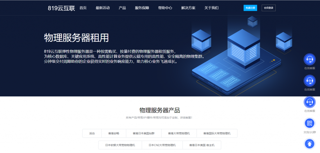
819云互联(800元/月),香港BGP E5 2650 16G,日本 E5 2650 16G
819云互联 在本月发布了一个购买香港,日本独立服务器的活动,相对之前的首月活动性价比更高,最多只能享受1个月的活动 续费价格恢复原价 是有些颇高 这次819云互联与机房是合作伙伴 本次拿到机房 活动7天内购买独立服务器后期的长期续费价格 加大力度 确实来说这次的就可以买年付或者更长时间了…本次是5个机房可供选择,独立服务器最低默认是50M带宽,不限制流量,。官网:https://ww...
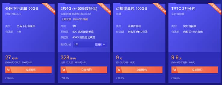
腾讯云CVM云服务器大硬盘方案400GB和800GB数据盘方案
最近看到群里的不少网友在搭建大数据内容网站,内容量有百万篇幅,包括图片可能有超过50GB,如果一台服务器有需要多个站点的话,那肯定默认的服务器50GB存储空间是不够用的。如果单独在购买数据盘会成本提高不少。这里我们看到腾讯云促销活动中有2款带大数据盘的套餐还是比较实惠的,一台是400GB数据盘,一台是800GB数据盘,适合他们的大数据网站。 直达链接 - 腾讯云 大数据盘套餐服务器这里我们看到当前...
DogYun27.5元/月香港/韩国/日本/美国云服务器,弹性云主机
DogYun怎么样?DogYun是一家2019年成立的国人主机商,称为狗云,提供VPS及独立服务器租用,其中VPS分为经典云和动态云(支持小时计费及随时可删除),DogYun云服务器基于Kernel-based Virtual Machine(Kvm)硬件的完全虚拟化架构,您可以在弹性云中,随时调整CPU,内存,硬盘,网络,IPv4路线(如果该数据中心接入了多条路线)等。DogYun弹性云服务器优...

-
软银收购arm就只买苹果手机是崇洋媚外吗腾讯空间首页手机QQ空间首页从哪里进入!天玑1000plus和骁龙865哪个好麒麟985处理器和天玑1000处理器哪个更好?视频剪辑软件哪个好常见好用的视频剪辑软件都有哪些?迈腾和帕萨特哪个好新迈腾和新帕萨特哪个更好一点·哪个更实用一点 ···明白人给解释一下·浮动利率和固定利率哪个好银行贷款是选固定利率好还是浮动利率二手车网站哪个好买二手车去哪里买比较划算?英语词典哪个好英语词典哪个好网校哪个好初中网校哪个好?oppo和vivo哪个好Vivo和OPPO哪个好点啊?